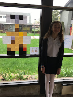
When we studied Adobe Photoshop at the beginning of this year, we saw what happens when we zoom in on an image. We no longer see smooth transitions, but squares of color. If a photograph does not have enough pixels at the size you want to view it, those squares will be visible and the image would not look natural or sharp. For this project, we tried to create that pixelated look on purpose.
To do this, we created a grid on Adobe Illustrator and filled it with squares of color to represent the parts of the image we were trying to represent with Post-it notes. Most of our artists chose to do a cartoon figure or a bold looking logo, as these images would be easiest to recognize, even in a pixelated format.


No comments:
Post a Comment
Thank you for your thoughts!
Barbara Levine
Ranney Lower School Art